My Images Are Dithered
My Images Are Dithered
I'll be honest: I am not an expert on the technicalities of dithering. However, whenever I encounter websites using creative dithering effects, I'm always curious about the "how." To satisfy that curiosity for others, I'm documenting my current process for creating those specific pink-tinted images.
Update: In a classic move of self-correction, I've already changed the look of the pictures again. The current version is what is detailed in this post.
A Note to the Hacker News Crowd
Welcome to all the HN readers who stumbled upon this! I'm glad this post provided some entertainment. Since this has reached a wider audience, I want to address a few points:
There has been some debate regarding whether my method actually constitutes "dithering." As mentioned, I'm no authority, but according to Wikipedia:
Dithering is analogous to the halftone technique used in printing. For this reason, the term dithering is sometimes used interchangeably with the term halftoning particularly in association with digital printing.
Regardless of the semantics, I was primarily focusing on the AM grid printing technique. It is important to note that this is a highly efficient way to shrink file sizes this experiment has nothing to do with optimization. In some cases, it might actually make the file larger. This is purely about achieving a specific aesthetic.
(Also, please refrain from feeding photos of me or my friends into an LLM!)
The Theory of the "Printed" Look
While dithering can be used to reduce storage needs by limiting the color palette while preserving detail, my goal was purely visual. This stems from a previous project called Designing without color, where I aimed for a "printed" black-and-white vibe, utilizing color only for specific emphasis (which, admittedly, looks best for light-mode users).
Digital vs. Physical
On a screen, pixels use RGB values to create varying intensities of light. Paper is different. To create the illusion of a wide color range with a limited ink palette, printers use a matrix of dots.
There are three primary methods for this:
- AM (Amplitude Modulated): The size of the dot changes.
- FM (Frequency Modulated): The number of dots changes.
- Hybrid: A mix of both.
| Feature | AM Grids | FM Grids |
|---|---|---|
| Mechanism | Variable dot size | Variable dot density |
| Pattern | Predictable/Structured | Random/Stochastic |
| Risk | Moiré patterns | Generally no Moiré |
The Moiré Problem: If AM grids are implemented naively, you get unwanted interference patterns. To prevent this, the DIN 16547 standard dictates specific offsets for colors.

The Technical Implementation
Since I manage my server via the command line, I use imagemagick (specifically the convert command) to process my images. I adapted a method I found online to simulate this AM pattern.
The Workflow
The process follows this logical flow:
The Command
Here is the convert string I use:
convert "oldfile" -resize 800 -set option:distort:viewport '%wx%h+0+0' \
-colorspace CMYK -separate null: \
\( -size 2x2 xc: \( +clone -negate \) \
+append \( +clone -negate \) -append \) \
-virtual-pixel tile -filter gaussian \
\( +clone -distort SRT 2,0 \) +swap \
\( +clone -distort SRT 2,15 \) +swap \
\( +clone -distort SRT 2,45 \) +swap \
\( +clone -distort SRT 2,75 \) +swap +delete \
-compose Overlay -layers composite -set colorspace CMYK -combine \
"newfile"
Breakdown of the logic:
- Sizing: Resizes to 800px width.
- Color Space: Shifts to CMYK.
- Manipulation: It separates the colors, scales the dots for visibility, and rotates them.
- Rotation Angles: The channels are rotated based on the set .
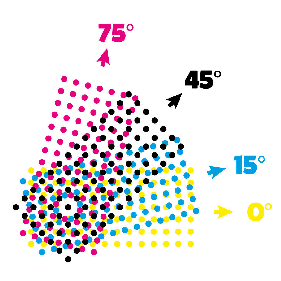
Refinement: The "Perfect" CMYK Route
After reviewing the results, I realized that the images still had some grayscale gradients because digital pixels allow for varying light intensity. To achieve a true AM grid look, each channel must be binary (only two possible values).
My updated checklist for the perfect result:
- Resize image to 800px.
- Convert to CMYK.
- Separate channels.
- Limit each channel to only 2 colors (The missing step!).
- Rotate and combine.
By forcing the channels to be strictly binary before the final merge, you eliminate the "muddy" look and get a crisp, authentic printed aesthetic.