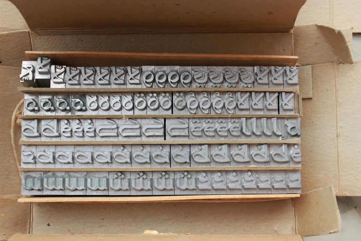
Unified Arabic
Unified Arabic: Combatting Illiteracy Through Typographic Innovation
By Yara Khoury Nammour (Originally published in Works That Work)
The exquisite, flowing nature of Arabic calligraphy has historically clashed with the rigid requirements of mass-production printing—technologies that were primarily engineered for the simpler structures of Roman characters. Unified Arabic (UA) represents a bold attempt to bridge this gap, though its path to global adoption has been fraught with challenges.
💡 The Moment of Discovery
The genesis of this project occurred in 1932 at the American University of Beirut. Nasri Khattar, a Lebanese architect, was substituting for a professor in a basic Arabic typing course. While attempting to type the greeting ahlan wa sahlan ("welcome"), Khattar struggled to find the specific key for the medial version of the letter heh.
In his struggle, he accidentally used the initial form of the letter instead. To his surprise, he found that the resulting text remained entirely legible.
This epiphany led to a critical realization: if the variety of letterforms could be reduced, the mechanical difficulty of typing could be solved without sacrificing the reader's ability to understand the text. Khattar committed himself to the task of "unifying" the script.
🛠️ The Typographic Challenge
For a student of Arabic, the learning curve is steep. One begins with basic, isolated shapes, only to be met with a complex array of variations. For example, the letter meem possesses four basic shapes but can manifest in over 30 different ligature forms.
Traditional vs. Unified Systems
The following table illustrates the core difference between the two approaches:
| Feature | Traditional Arabic Script | Unified Arabic (UA) |
|---|---|---|
| Letter Variations | Initial, Medial, Final, and Isolated | One single form per letter |
| Total Glyphs | Up to 150+ (including ligatures/marks) | Approximately 30 |
| Complexity | High (Calligraphic/Cursive) | Low (Streamlined/Mechanical) |
| Typing Difficulty | Extreme (Too many forms for keys) | Efficient (1:1 mapping) |
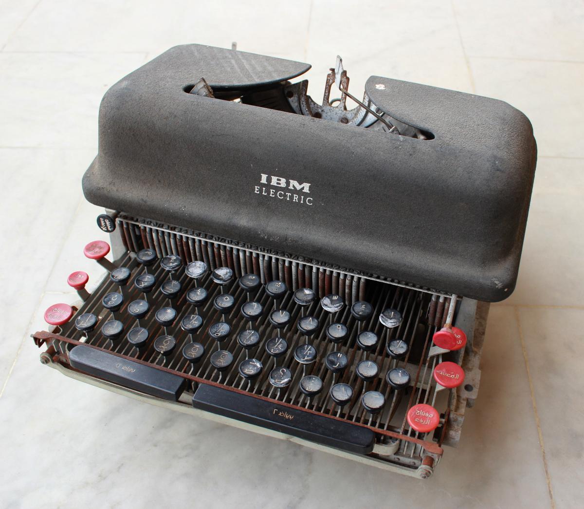
The traditional system relies on letters connecting within words, meaning most of the 28 letters change shape based on position. When you add vocalization marks and ligatures, the character set becomes massive. This created a hardware nightmare: the required shapes simply would not fit on a standard keyboard of 44 keys.
📐 The Design Philosophy
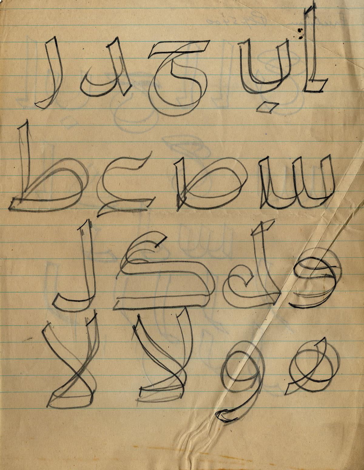
Khattar employed a reductive design process to distill the script. His goal was to find the most "characteristic" essence of each letter.
His sketches reveal a rigorous struggle to balance functionality with aesthetics. He sought to align Arabic with the "streamlined spirit" of the West—emphasizing speed, mechanization, and labor-saving proportions similar to Latin type.
🏢 Corporate Adoption and Social Impact
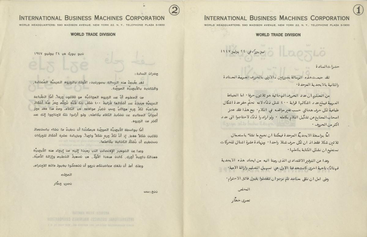
Khattar first approached Remington Rand. While they produced a single prototype machine, they failed to see the long-term value. IBM, however, recognized the profound socio-political potential of the system.
"I am going to stake my reputation as a literacy man: I believe that, using this alphabet, the illiterate will learn in one-tenth the time that it now takes; and that means that probably ten times as many people will learn to read." — Frank Laubach
Mathematically, Laubach's hypothesis can be viewed as:
Historical Context of Illiteracy
By the late 19th century, the inefficiency of Arabic printing had caused severe social damage across the Levant (including):
Turkey(Ottoman influence)- Syria
- Lebanon
- Palestine
- Egypt
Books were prohibitively expensive and reserved for the clergy and the elite. After centuries of stagnation under Ottoman rule, and influenced by European colonial presence, the region began to feel the impact of the Industrial Revolution.
⌨️ Technical Optimization
Khattar didn't just change the letters; he redesigned the interaction. He proposed a keyboard layout optimized for frequency of use, mapping common letters to the most accessible keys. This allowed UA typists to potentially exceed the typing speeds of English speakers.
Project Goals Checklist
- Reduce glyph count to forms.
- Maintain legibility for native speakers.
- Fit the alphabet onto a standard mechanical keyboard.
- Lower the barrier to entry for literacy.
- Increase the speed of book production.
Ultimately, Unified Arabic was more than a font; it was a tool for democratic access to knowledge, attempting to strip away the calligraphic complexity that had inadvertently acted as a gatekeeper to education.